The Story Behind Our New Logo
Written by Janet Chu
As Orchid Boutique continues to evolve, I wanted our branding to feel more connected to the physical space of the store. The signage had already established a visual direction, and I designed the new logo to reflect that look so the storefront, interior, and brand identity would all feel like part of the same story. Rather than creating a logo first and designing the store around it, this logo grew out of the atmosphere and visual language we had already begun creating in the shop.
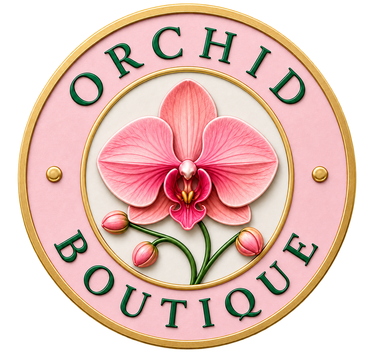
I have always been drawn to the shape of a circle. It feels balanced, complete, and timeless, and I wanted that shape to become the foundation of the design. The words Orchid Boutique wrap around the outer ring, creating the feeling of a classic emblem, while the orchid remains at the center. I wanted the name and flower to feel connected rather than separated, almost like everything is held together within one continuous frame.
At the center is a sculptural pink Phalaenopsis orchid, surrounded by a vivid pink field. The orchid bloom, buds, and curved stem give the logo movement and reflect what we work with every day — living plants that continue to grow, change, and bloom. The flower is intentionally the focal point because orchids are not only what we sell; they are at the heart of our design work and the identity of Orchid Boutique.
The color palette of pink, green, gold, and warm ivory was chosen to complement the store signage and create a look that feels elegant, artistic, and welcoming. The rich pink brings energy, prosperity, and personality, while the gold adds warmth, sophistication, and a sense of craftsmanship. The ivory outer ring softens the contrast and gives the logo a timeless quality. Together, the colors feel bold without being overly formal and luxurious .
The raised gold borders and dimensional lettering give the logo the appearance of an emblem rather than a flat graphic. I especially wanted it to feel like something that could belong naturally on the storefront, on packaging, on signage, and throughout the shop. The two small gold accents on either side help balance the composition while keeping the orchid at the center of attention.
For me, this redesign is about continuity. The signage established the visual identity of the store, and the new logo now carries that same identity into everything else we do. It creates a stronger connection between the physical Orchid Boutique space and the way the brand appears online, on packaging, in our photography, and in the pieces we create for our customers.
Our arrangements have always combined nature with artistry, and I wanted the logo to express that same idea. The orchid represents natural beauty and growth. The gold reflects craftsmanship and detail. The pink brings warmth, personality, and joy. And the circle brings everything together.
This new logo is not a departure from Orchid Boutique — it is a reflection of what the store has grown into. It carries the look of our signage into a symbol that can travel with us as the brand continues to evolve.
